Two Definitions of Color (Or, the Meaning of Analog Art in 2023)
DEFINITION 1: A POINT ON THE SPECTRUM
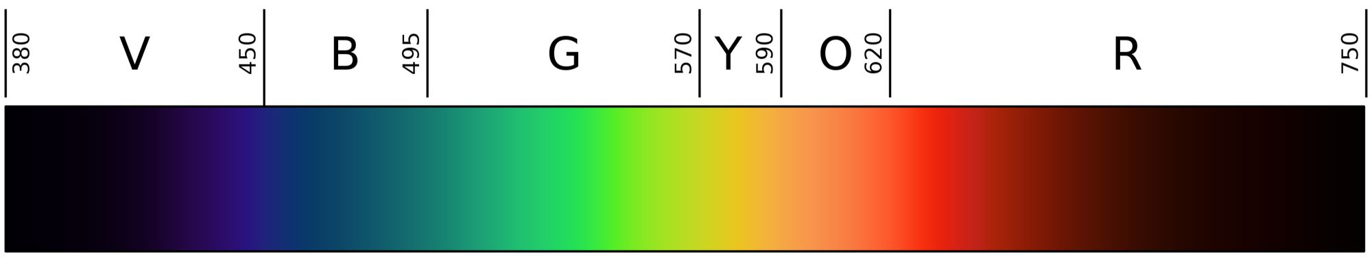
WHAT IS COLOR? Ask a well-educated modern individual, and they may offer a scientific explanation, based on the physical properties of light. Thanks to Isaac Newton and generations of science teachers, we all know definition #1: "A color is a particular wavelength of electromagnetic radiation."
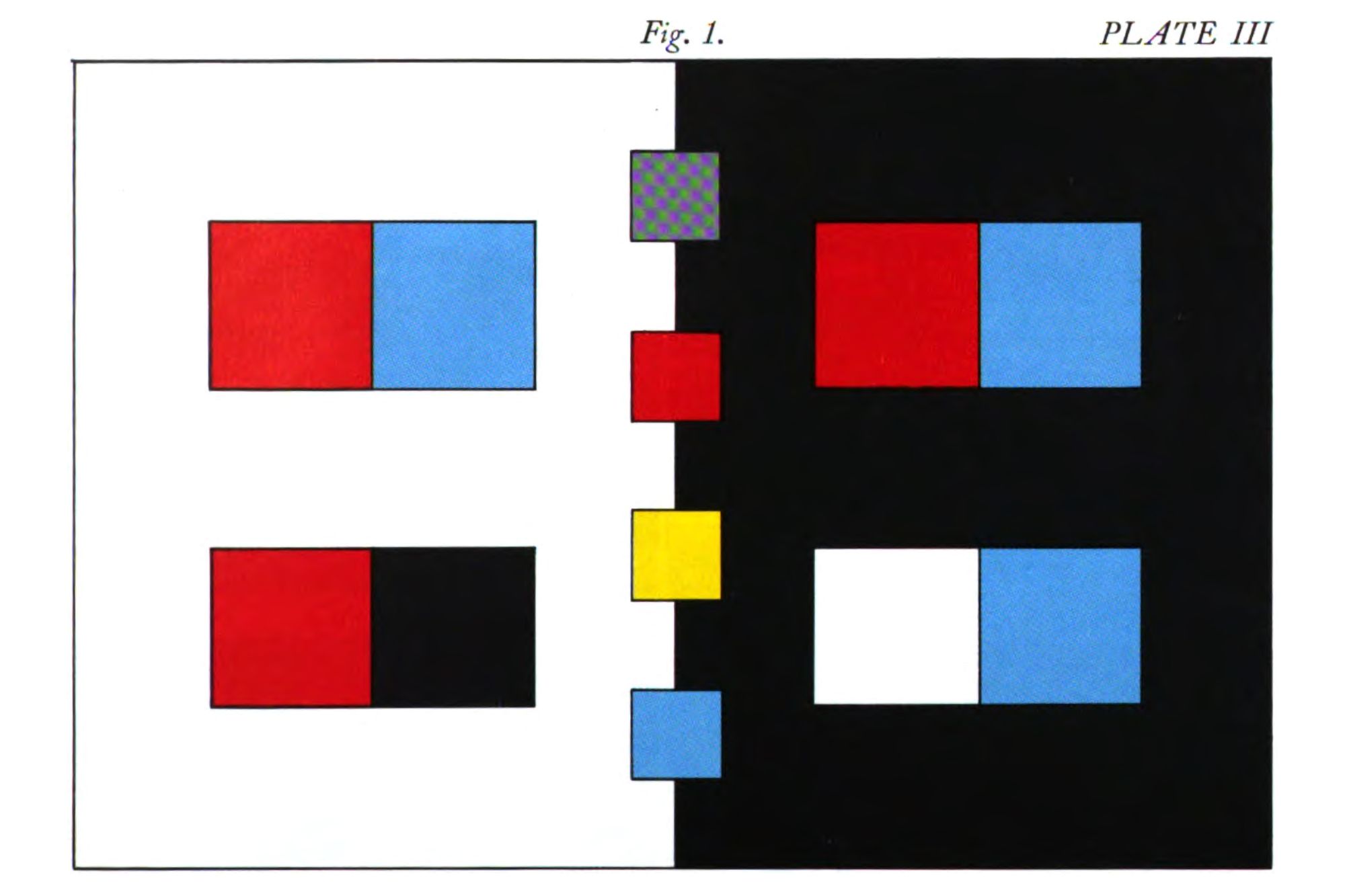
Notice that this definition involves only one variable. This is incredibly useful to scientists and engineers, since it allows for brute-force processing of color information, one point of light at a time, with standardized processes and results. Modern color systems vary in how they define the range of available colors, but each one maps a specific group of colors (called a "color space") within a field defined by a finite number of measurable qualities, like hue, saturation, and luminance. You are probably reading this article in sRGB color space, which covers about 30% of the visible spectrum and has been used for computer monitors since the 1990s.
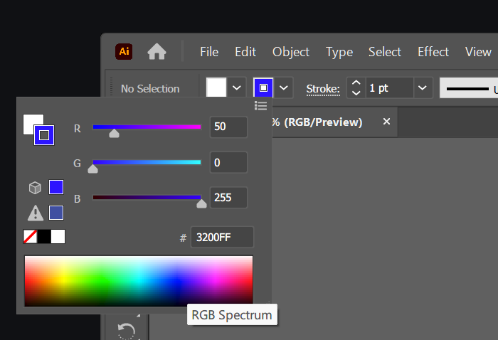
Definition #1 leads to the system of hexadecimal colors for Web design and the ubiquitous rectangular Color Picker for print and display design. These are the everyday visual representations of Newtonian color.
HIDDEN DIMENSIONS
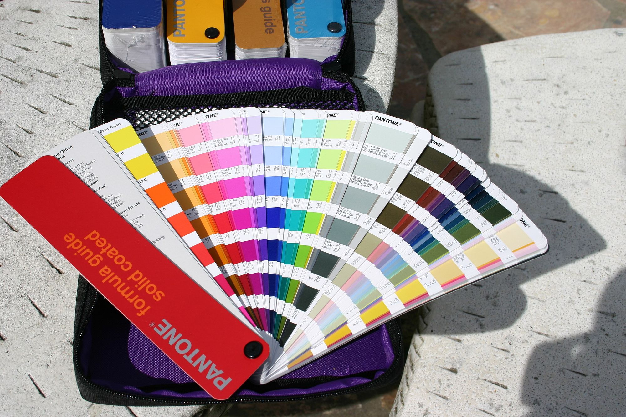
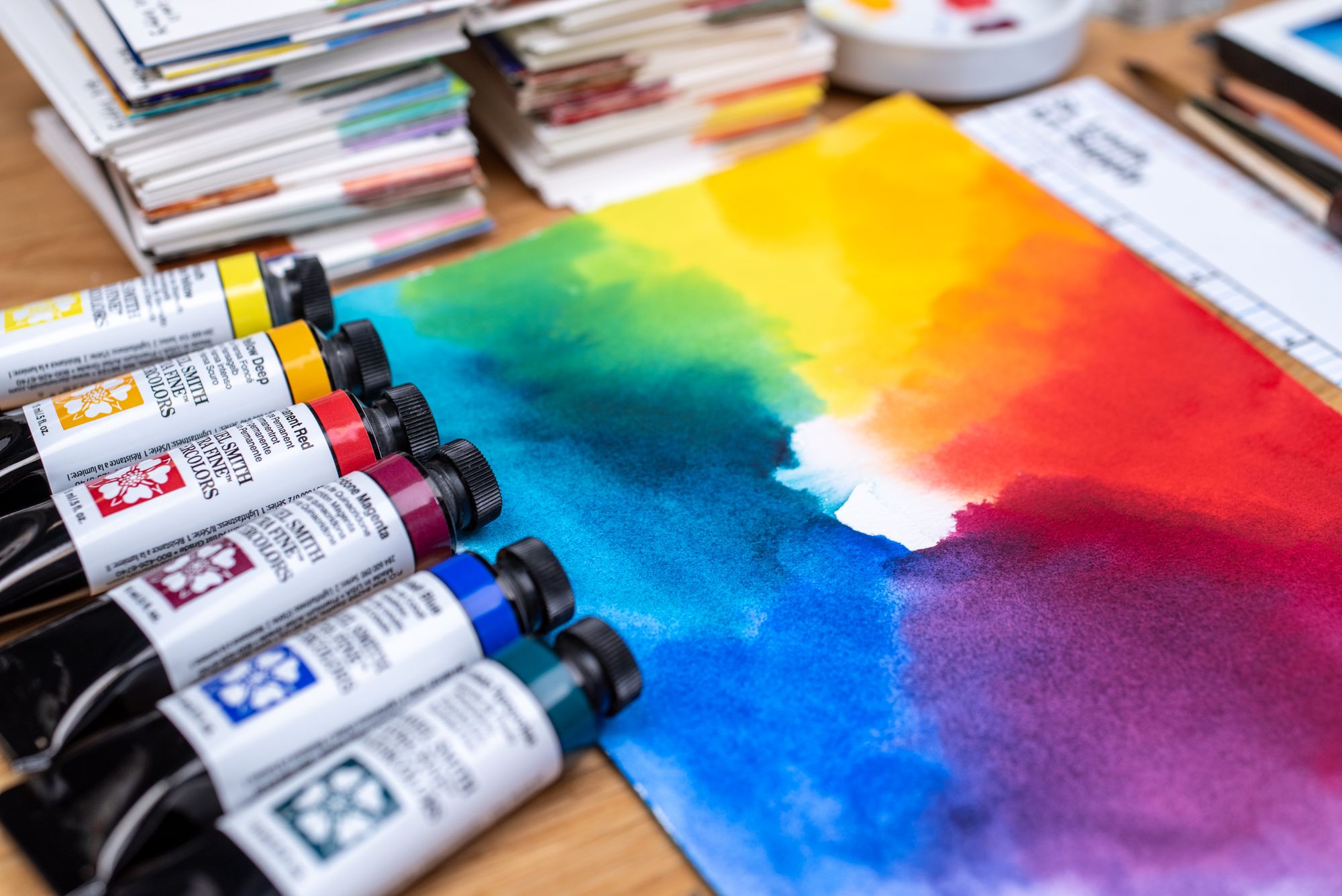
Newtonian color accounts for several of the important variables that artists need to control, but it also conceals an infinity of variation and complexity behind each color code. For example, identical settings produce different results on different kinds of paper, with different finishes and different degrees of color variability depending on the materials used. Suddenly we need a whole stack of two-dimensional color charts, one for each dimension we're adding to our understanding. (This is why print designers use those giant swatch books with different finishes and substrates.)
Each time we feel the need to duplicate the Color Picker because of differences in how the color appears in reality, we've identified a hidden dimension of color.
Consider the third dimension, which is of course missing from the flat Color Picker. One set of RGB or CMYK values becomes many colors when it's given a physical form. Even the thinnest coat of color on paper adds depth and casts shadows, and these value gradations are not accounted for by the color code. And yes, admittedly, you can analyze the resulting physical object into many color codes, like a digital camera does. But this is not always a useful heuristic.
Even the fourth dimension—time—must play a role in the artist's understanding of color. Over short time intervals, the positions of objects, viewers, and light sources change, creating an interplay of light and shadow that would have to be expressed by an incredibly complex series of color codes and time signatures. Over long periods of time, even the materials change. When you apply white oil color to a canvas, it may be color code #F7FAFF, but in a hundred years it will have yellowed to #FEFFF7.
All of this is simply to say that physical reality does not accept numerical inputs; it is a complex system that changes with time, viewing angle, the other objects present and their colors, and endless, uncountable, other factors that affect how we perceive the color of a thing. We can derive numbers and rectangular charts from this infinite flow of phenomena, but for an artist attempting to create a specific effect, a more holistic approach is called for.
To make analog artwork, we have to reckon with the complexity of color as it is in physical reality; otherwise, our work won't look like we intend.
DEFINITION 2: COLOR AS A MATERIAL
Being an analog artist means approaching color as a material—fundamentally, as a physical thing that we can use to make art. This brings us to Definition #2:
Color is a physical material with colorant properties; in short, anything that colors other things.
I'm not saying this is the only useful definition of color. But I think it's the most useful one we have in the artist's studio. We have to work from a 'color,' in the Definition #2 sense, every time we paint or draw. When we open a tube of Prussian blue with artistic goals in mind, it's important to know about the color's features in all their fullness and complexity, not just that we will be producing light around 480 nm in wavelength.
Like all physical objects, each color is easy to use for some purposes and difficult to use for other purposes. These purposes include, but are not limited to, making artworks reflect specific wavelengths of light. We may use a color to draw the viewer's attention, for example, and this is easier to do with vermilion than with grey. Or we may use a color to provoke an emotion, and some emotions are more strongly associated with particular colors. It is more difficult to make a moody painting with bright pink—a functional issue that is not captured by Newtonian color.
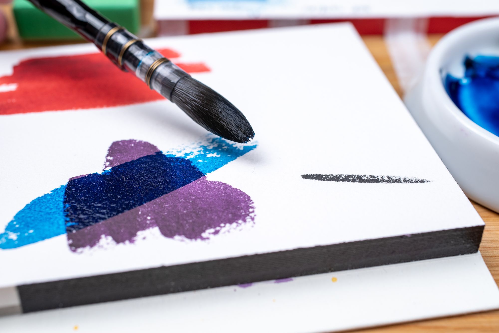
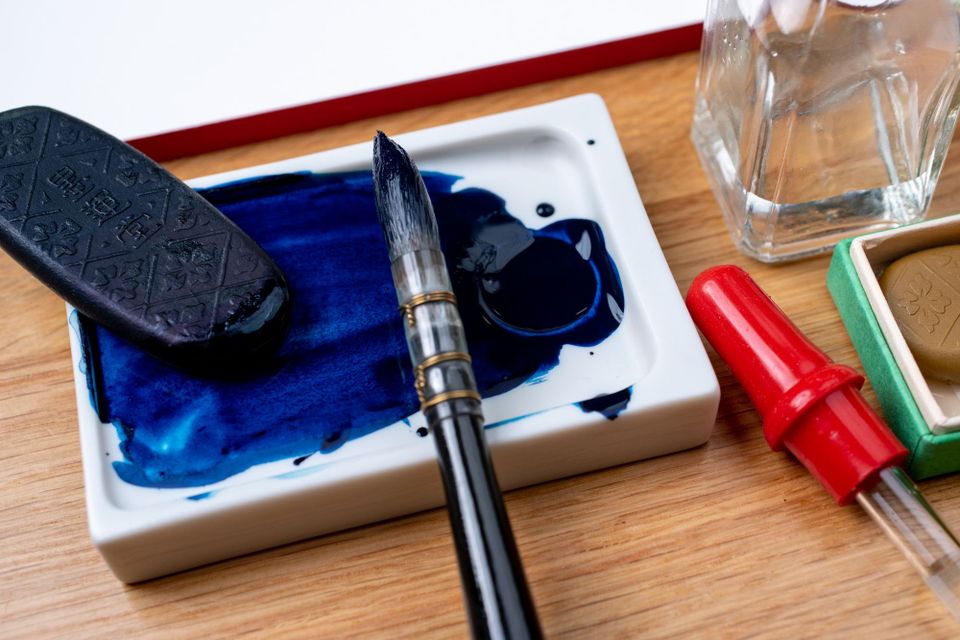
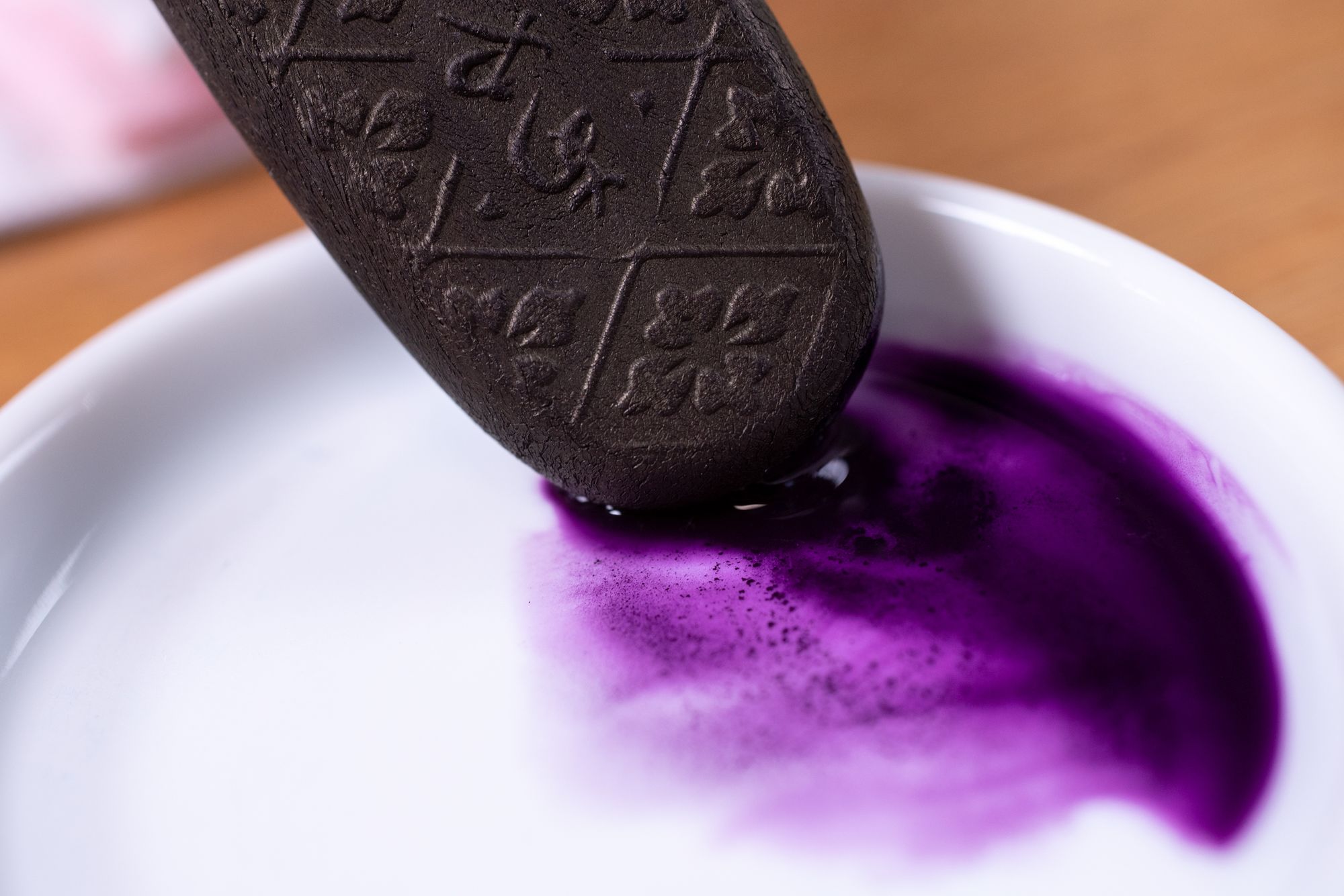
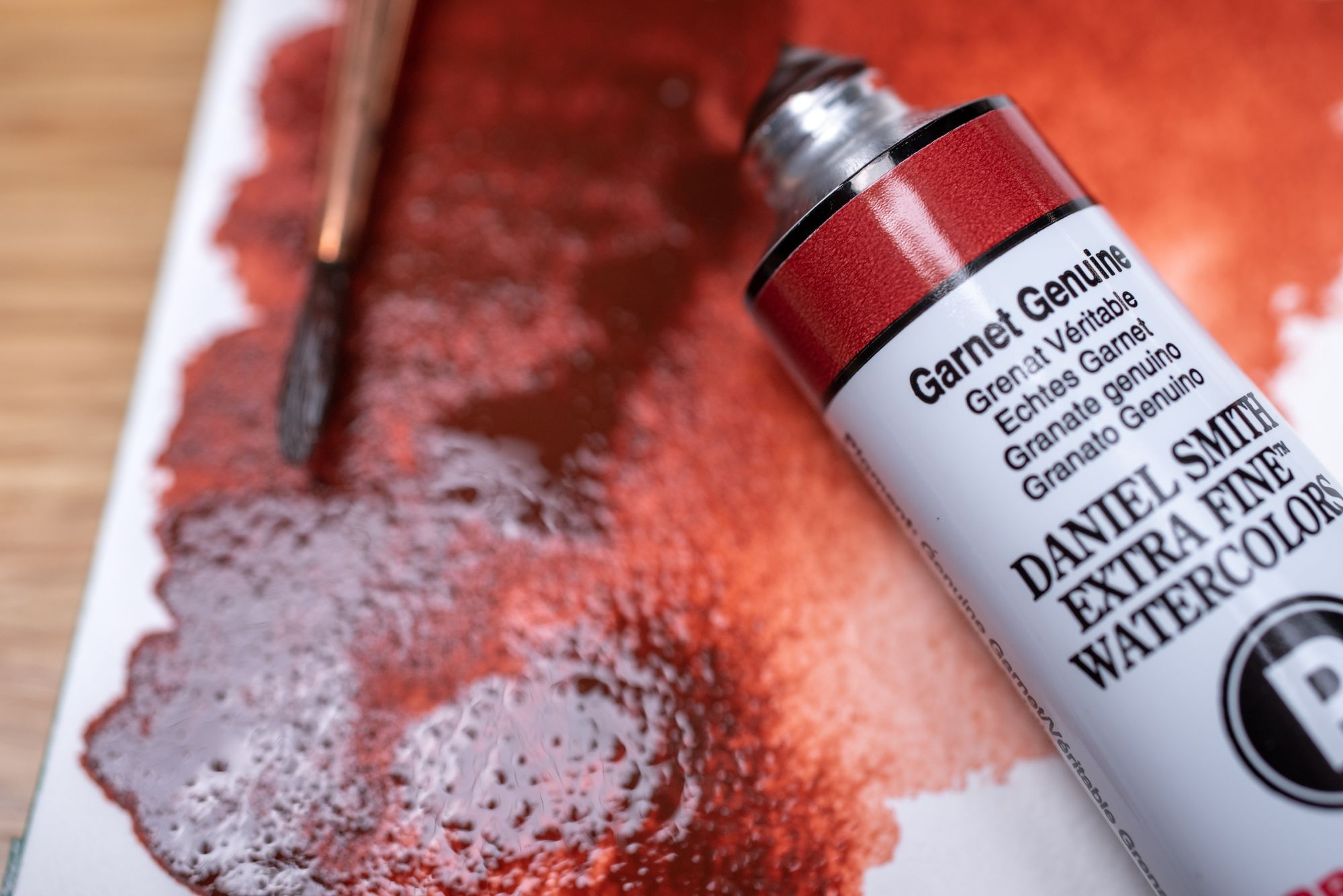
If that's too abstract for you, consider the more concrete functional issues artists face in the studio. Some colors are strong tinters and others are weak; this may be the case even if they have an identical Color Picker value out of the tube. Some are opaque and some are transparent, and the transparent colors have different glazing tones that are not always obvious from the masstone.
Viewed this way, a color is much like a type of clay or a species of wood. A fine piece of cherry can be carved into different shapes and used for different purposes. It can be lacquered, varnished, and stained, to varying degrees modifying its natural character. It takes almost no artifice to make a lovely reddish surface with cherry; but it's very difficult to make it look like walnut. It's softer than most other wood, so while it's a great choice for furniture, you probably wouldn't use it for the load-bearing surface of a hand tool.
Woodworkers and sculptors know all this, and are not generally tempted to reduce their work to an arrangement of points and vectors, even if that is technically possible to do after the fact. When we imagine the ceramicist at work, we think of an intimate dialogue (sorry, Swayze haters) between the artist and the clay. Physical things do not simply follow our instructions; we have to shape them in accordance with their intrinsic properties. Sometimes it feels like we have to sneak up on our materials and trick them into doing what we'd like.
As we can already see, this painterly way of thinking seems to involve anthropomorphizing our colors. They have complex personalities; they like to make certain secondary colors but not others; they are changeable or reliable in varying proportion. Knowledge of a color is like knowledge of a friend—we know what interests them, their skills and shortcomings, their emotional range, and their individual history.
Unlike our friends, our colors are made specifically for our use, and ethically speaking, we need not ask our colors' permission before we put them to a particular purpose. But it is still a good practice to listen to what each color has to say. Not all blue/yellow pairs mix equally well, and some seem to rebel against each other. When you have made and discarded ten shades of baby-poop brown, and you have begun to wonder why you ever became a painter in the first place, you have discovered something about the colors you're using. Stop trying to mix colors that don't want to be mixed.
Here's a good example that you will hear in most Painting 101 classes: when making a tint (a mixture of a color with white, creating a pastel color or off-white shade), start with white. Virtually every color is a stronger tinter than white, and you can drive yourself crazy dumping multiple tubes of Zinc White into your seemingly tiny pool of Phthalo Blue. Yes, technically, you can get the same color with ten times the paint volume, but that makes things more difficult, so why not listen to that built-in difficulty and reverse your order of operations? To do otherwise is like throwing dry clay.
THE MEANING OF ANALOG ART IN 2023
If you make analog art today, you have probably heard from well-meaning friends and family that it is no longer necessary to use paint and pencil, because there are great brushes in Procreate now.
Look, we do a lot of digital art and design around here, and we like it! But it simply isn't a replacement for the huge variety of analog art practices that contemporary artists can choose from. The materials of vector art (like Illustrator files and typefaces) and raster art (like Photoshop and Procreate files, scans, and digital photographs) are pixels, lit with a limited number of colors, without depth or texture, and with an intrinsic tendency toward hard and jagged transitions—unlike the soft marks and complex textures that are easily made by pastels and brushes.

In addition to the sensory advantages of analog, there is a benefit to artists and creatives that will be very difficult to replicate with advances in digital art: the receptive, mindful state accessible through analog materials. Scientific research in psychology and education has consistently shown that handwriting, drawing, and painting are powerful activities that reduce stress and encourage learning—and that digital alternatives do not replicate these benefits.
Maybe it's because digital art is so frictionless, while analog art requires you to engage in a creative, memorable push-and-pull with your materials. You know in advance what colors you can make in Illustrator, and that's awesome, because every print shop and computer monitor uses the same color charts and can perfectly reproduce your work. But you don't know in advance what colors and effects you can make with a set of paints—even a set of paints you've used before! As you try to mix new colors, make thicker or thinner layers, or paint on different surfaces, you'll discover more of the endless little strengths and weaknesses of your materials.
Surprises are frequent in the analog art-making process. You may return to your notebook to find that a color has dried differently than expected; you may mix two colors and discover that they separate and make unusual patterns. You may also spill paint water all over yourself.
Whether the surprises are good or bad, the high-wire act of analog art requires the openness and adaptability to face them as they come. Even if the artist has detailed sketches and color swatches, the making of analog art happens in the moment of physical application and cannot be scripted in advance. Things happen in the art studio, sometimes because a perfect beam of light hits your canvas, but more often because the room was too humid or something, and in the immortal words of Mike Tyson, "everybody has a plan until they get punched in the face." There is no undo key here. Your paint might just melt off your canvas without warning if you do it wrong. You have exited the Color Picker now. This is a place where you need a lot more of your brain than usual, and it is really, really colorful here.